TL;DR.
An engaging logo is extremely valuable to a business. You logo is the visual representation of your business which allows you to stand apart from your competition. In this blog post we examine the Maven X logo and the branding design process that went behind it. We examine 8 logo design tips and principles, various considerations in designs, methods to use, and ultimately examine them against the Maven X logo design. We finally look at how all of these design details and principles should be documented and solidified into a branding document.
Introduction.
Your logo is the identity of your business. It’s important that your logo is recognizable, unique, gives customers a general idea of your business, and that it’s versatile. While most of you reading this post aren’t going to design your own business logo it can be incredibly helpful and useful to know how to communicate your vision to a designer. You will also want to be able to ask for designs of the logo you may need for different applications either on print, digital, light background, and dark backgrounds. We are going to take you through how our Maven X logo was designed and discuss our methodology, the considerations you should make when designing a logo, and why you should have a branding guide.
Our Methodology.
The Maven X methodology for everything is more or less the same. We want things to be; simple but powerful, beautiful and elegant, and visually appealing. Before that we apply it to our 8 values. Your logo needs to speak about your brand, values, and convey a small sense of your business to anyone that looks at it.
For the Maven X logo and Maven X we want to look elegant, professional, modern, and visually appealing all in one. The services we are providing to our clients are professional services to take their business to the next level. We need to demonstrate that we are able to meet and exceed those expectations to provide the best service to our clients.


If our logo looked cartoonish like it belonged in a kids cartoon we wouldn’t be taken serious in the space that we are in. If we looked like we were an action/outdoor company we wouldn’t be associated with professional services like web design, media design, strategy, cyber security, and more. We want to be different from all of the traditional consulting companies so we need to look very modern and demonstrate that we are new, fresh, and taking on a different approach. Lastly we want to be visually appealing. We are selling design services. If we cannot design and create appealing designs, no one will want to look at our logo or want us to design anything for them. Simplicity speaks volumes in all areas of our logo.
Now this methodology doesn’t relate to everyone and everything; this is our methodology! We are in no way speaking down to designs or businesses who do the opposite of the mentioned points. The important thing is that the methodology is defined, specifically designed for you and your business, and that it is adhered to. So what is your methodology?

8 Things to Consider When Designing a Logo.
When conceptualizing your logo, designing it yourself, or explaining your vision to a designer there are certain things to consider for the design. Especially if you aren’t going to be designing the logo yourself, you’ll want to make sure you are getting the most out of your time and money by having a general idea of each one of these points when you take your idea to a designer.
1. Make It Represent Your Company
Your logo is the visual depiction of your business. It should represent what you stand for and what you’re trying to accomplish. Consider the industry and even the audience you’re trying to attract. When you get a logo it should be immediately identifiable to your business in an instance.
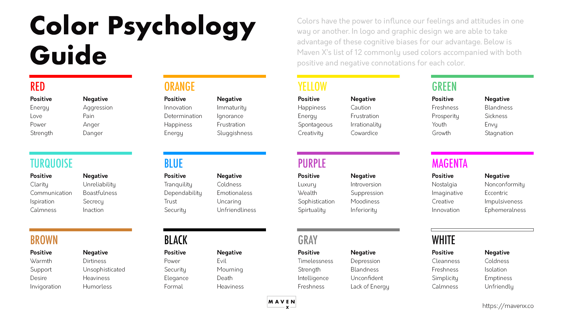
3. Consider Color Psychology & Typography
Colors trigger human emotions. Utilize these emotions in your design. Every single large business deploys this in their logos. For example, red is associated to passion/love/fear/strength while blue is associated to trust/knowledge/security. Perform your research on the colors, what the associated emotions are and what some typical industry associations are.
5. Design In Black and White First
While your logo will most likely deploy color try to see it in black and white first. Why? It will give you a full visualization of the actual design unhindered by color and various effects color can have on the look. The logo needs to look good in black and white before it will look good in color. Another reason this is important is due to mono logos, which we will talk about later.
7. KISS (Keep It Simple Stupid)
A unique logo doesn’t necessarily need to be visually complex. Think minimalist. Look at most Fortune 500 business logos. They are, at the core, very minimal. Consider minimal colors, shapes, icons, fonts, and more. Most times a minimal logo speaks more volumes than a complex and cluttered logo.
2. Consider the 5 Principles of Logo Design
- Simple
- Versatile
- Timeless
- Appropriate
- Memorable
A complex logo is a lot to look at and can limit application. Making the logo versatile can expand application. Logo design can be time consuming and expensive. Not to mention you’re going to be putting your logo everywhere. You want to make sure that your logo is going to look just as good now as in the next decade at least. If needs to be appropriate for the audience and the industry you’re in. Finally, people should remember it. If you quickly flashed your logo on a screen, people should be able to identify it immediately.
4. Make It Unique
This is a given… but you shouldn’t want to look like some other company! While the heart behind graphic logo templates is from a good place you shouldn’t have your logo be based from a template. Have a designer, like Maven X, custom design your logo for you from scratch. If you glance at it quickly and it reminds you of another brand or company, make changes.
6. Make it Scalable
Scalability plays an important role in the design of your logo. Your logo will be added to everything from business cards, websites, social media, posters, and maybe even billboard advertisements. The logo needs to be responsive meaning that it can adapt or change to different sizes and orientations. Ideally your logo should be designed as a vector image first.
8. Test on Different Mediums
As mentioned in 6, you will be placing your logo on lots of things. It’s important to test how it will look on shirts, hats, social media sites, paper, outdoor signs, on the sides of vehicles, and more. While you don’t need to physically create these items to spend lots of money on them, you can ask the designer to create various mockups of the logo on those items. This will give you a general idea to make a decision.
Maven X Logo Design Tips.
Now let’s dive into the Maven X design specifically! We followed each of the criteria when designing our logo. We will see a practical approach to how our logo was designed and specifically applied to the criteria items.
1. Make It Represent Your Company
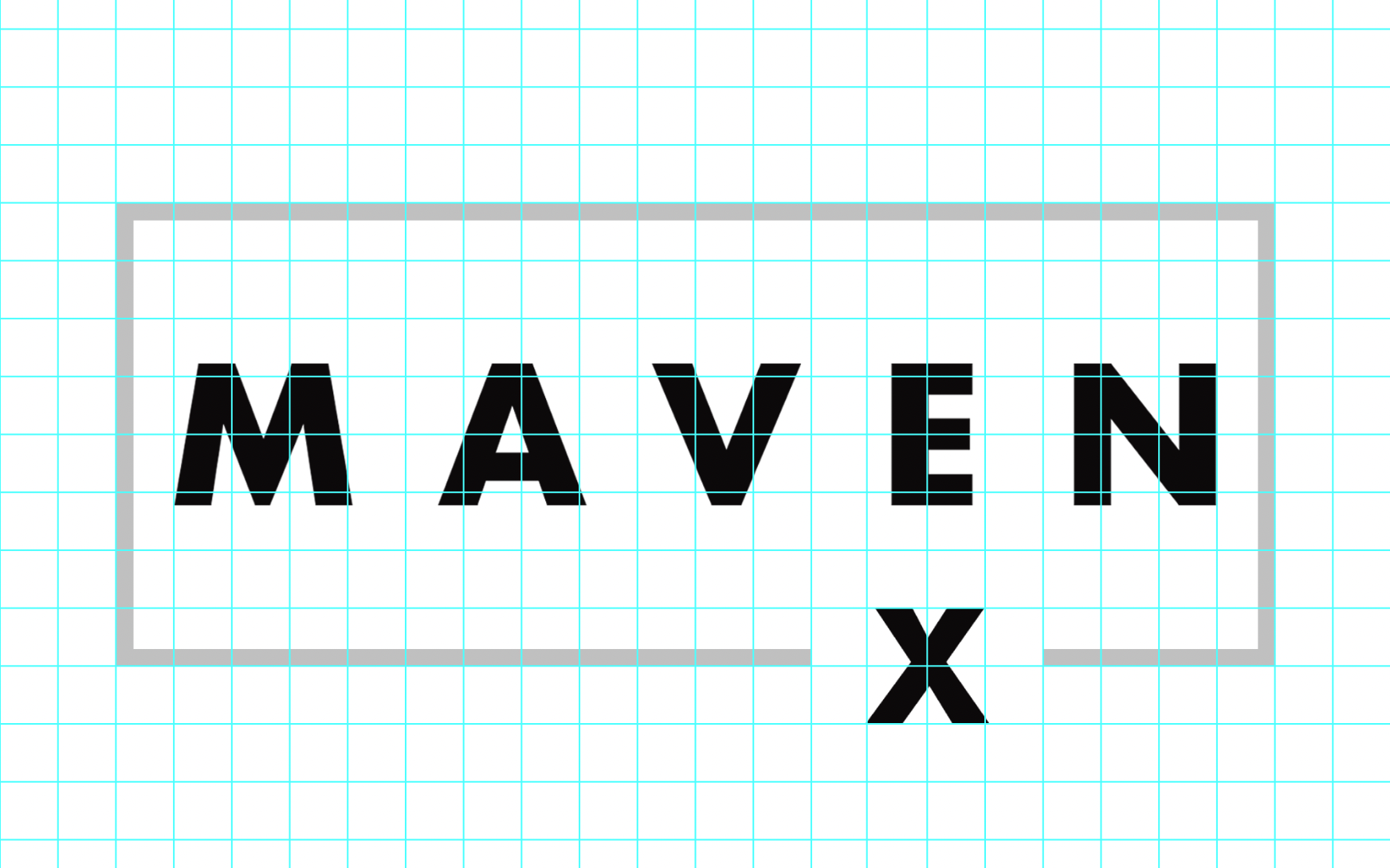
We believe that the Maven X logo lives up to our drive for excellence. The modern and professional feel indicate the focus we have in all aspects of our designs. The logo is aligned perfectly inside the grid lines which ensures proper alignment. The font has extra space between each letter to place an emphasis on the word ‘Maven’ which is an expert in something. The angles between the letters are aligned like in between the ‘A’ and ‘V’ and squared off between the ‘E’ and the ‘N’ letters. The ‘X’ is separated from Maven because the ‘X’ is a place holder for whatever service we are offering. This doesn’t limit us to just one industry or select offerings.
The overall clean, minimalist, and purposeful design of the Maven X logo gives clients and customers the sense of trust, an impression of professionalism, and a general aesthetic appeal.
2. Consider the 5 Principles of Logo Design
The Maven X logo is simple ✅ versatile ✅ appropriate ✅ memorable ✅ timeliness… we will have to see as time goes on but we think it is! Diving into versatile, since this could be the more difficult item from the 5 principles, what makes a design versatile? It has a lot to do with the application of your logo and this is important to decide. Where are you going to use your logo and on what? In our other sister blog post to this Logo Design Variations (Why They Make or Break Your Logo) we discuss the various logo alternatives to the Maven X logo to give us more ability to place the logo in other places. Different versions while still keeping the same appearance is important to versatility.
3. Consider Color Psychology & Typography
In the primary Maven X logo design we utilize four colors; black, white, silver, and a light blue. Each of our specific services utilize separate color schemes on their own. The beauty with using these colors is that it gives us versatility to place the logos on almost any color backgrounds all why utilizing the color psychology effectively. So what does each color positively convey?
Black: sophistication, security, power, elegance, authority, substance.
White: cleanness, clarity, purity, simplicity, sophistication, freshness.
Gray: timelessness, neutrality, reliability, balance, intelligence, strength.
Blue: trust, loyalty, dependability, logic, serenity, security.
The words that we wanted to apply to our brand is noted by italics. As discussed earlier, the Maven X brand, logo, and the selected words all work together very well to convey our message to our clients.
The font that we chose is called Futura. Futura is a sans-serif typeface that has a bold option which gives a bold look and feel to the text. We knew that we would be using the ‘X’ a lot in our designs and mentions in text, so we wanted to make sure that it had some weight. A skinny ‘X’ doesn’t look very strong.
View and download our free Color Psychology Guide to use for your next project! ↓
4. Make It Unique
While the Maven X design in and of itself isn’t unique (simple text in a box), the way that we customized something so simple to make it our own is unique. Spacing out the text in ‘Maven’ and cutting the box out with the offset ‘X’ is so simple yet so powerful. Immediately if you’re shown this logo you would be able to recognize it and identify it back to us based on the ‘X’ placement and the bold spaced text alone. This is what you want to achieve with your design.
5. Design In Black and White First
Color is great, as we discussed in point 3 however, it can cloud some vision when it comes to the form and structure of the logo. Color can great various 3D type effects on shapes and letters for one but it also brings emotion into the mix in regards to the psychology. Stripping all color down to black and white let’s the form and structure of the logo to speak out alone. If your logo doesn’t look good in black and white chances are it won’t look good in color either. Additionally, there are some use cases where you may need to utilize mono-colored versions of your logo which will put it in black or white. Once you feel comfortable with the design start adding color in slowly and intentionally. Then refer back to point 3.
6. Make it Scalable
You never know where your business will go. While you want your logo to be placed on a website, social media posts, and an email signature right now you never know if it will be going on a massive billboard. Fixed logos designed in specific dimensions are limited to their max size. It’s best to have the logo designed in something like Illustrator in a vector .svg format. This converts all the lines, shapes, text, and other elements into a math equation vs. pixels. This allows you to scale your logo up to infinite sizes without causing pixelation and distortion.
Another thing to consider is the look of the logo when scaled up. Your logo’s size in relation to other elements such as text, images, and more might not look as great if the logo is too big or too small. Take note of these discrepancies and decide if they’re something you can live with or if they need to be changed. If you want to keep the logo with those discrepancies make sure to note them in your branding guide for proper logo usage.
7. KISS (Keep It Simple Stupid)
We’ve already talked in several aspects why simplicity is more valuable than complexity. I don’t know about you, but I have a way of taking simple things and making them complicated. I do this more often than I’d like to admit. This is why I have to remind myself to keep things simple. You might have some good intentions with taking things farther but when designing your logo take a look at it and think about the design in the long run. Think about seeing it every day for the next decade. Is it simple enough or is it too complicated? If it’s too much, take it backwards a little bit. Sometimes it takes seeing the complicated version to appreciate the simple version. So definitely experiment, take it far and if it doesn’t work out that’s ok! Just reverse the process until you’re back where you feel comfortable again.
8. Test on Different Mediums
You will place your logo in lots of different spaces: websites, social media posts, shirts, hats, coffee mugs, on outdoor signs, on the sides of vehicles, on posters, in videos, and so much more! This is exciting! Different mediums, fabrics, and materials could potentially change the appearance of your logo. This can be especially true with fabrics as you might not be able to get the fabric color to match exactly to your colors if the colors are not typical colors. You may have to slightly tweak the color to what’s available and it may not have the same appearance.
It’s probably not financially feasible to take a concept logo and physically order various mediums to test the logo. Instead utilize mockups from the designer or create your own to get a general sense of how the logo may look. Test it on all mediums you can conceptualize your logo being on in the future.

Importance of a Branding Guide.
A branding guide is an important tool for your business. While it’s not mission critical it helps to align and solidify all of this design work onto a guide. This guide can be used by employees, external designers, and others to ensure that your branding is cohesive across all avenues where your logo and branding appears. Branding guides will typically outline the design fonts, colors, all logo variations, how much space should be in between the logo and other objects, and usage examples.
All details that you have discovered during the design process should be documented. If for example, you found out that your logo looks HORRIBLE on lime green colors, note that the logo should never be used on lime green colors. The branding guide will help you and your business look professional as you grow and more people join the team. Your business and all products with the logo will look cohesive and similar within the guidelines.
See some exports from the Maven X Branding Guide for some examples!


Note: This is not the entire Maven X Branding Guide. Your Branding Guide should contain more information. These excepts demonstrate the logo, font, and color usage pages only.
Final Thoughts
An engaging logo with the branding to go along with it is a journey that doesn’t happen overnight. It’s important that the process isn’t rushed and a decision is made without first properly considering all of the usage possibilities and assessing how well the logo feel and design matches with the vibe you want to convey for your business. We hope that this guide and the information is inspirational and helpful to you as you begin your journey! We also hope that you were able to learn more about us and our branding as well.
Overwhelmed with the information? Unsure how to design and create your own logo? Don’t worry! Maven X has you covered. Maven X offers logo design services under our Maven Design Services. Get a custom logo designed for your business, receive product mockups, and even get a customized branding guide. Let us help you design the look and feel of your business for decades to come!
Join Our Mailing List
Your inbox is important to us. Maven X will only send you a once a month recap of all things going on with Maven X including: newest blog posts, promotions, news, and other helpful resources!
Latest Instagram Posts


